With Big Ten play now in full swing, the Daily Cardinal takes a look at ranking every team’s uniforms:
14. Illinois: The Illini are in this spot purely because of those atrocious “grey ghost” outfits they wore against the Badgers. Overreaction? Probably, but I’m standing by it. Grantland Rice might have described Red Grange as a “grey ghost,” but we’ve invented something called “color television” in the years since and it’s a good idea to take advantage of it. Plus, the uniforms look less like ghosts and more like the inside of an unfinished building. Get back to orange and blue, Illinois.
13. Rutgers: When the Scarlet Knights joined the Big Ten in 2014, it was a golden opportunity for the program to create a new identity. So far, the Knights’ sartorial choices have been just as underwhelming as their on-field performance. Unlike some of the other teams low on this list, Rutgers hasn’t brought us any truly atrocious uniforms, but they’ve been completely unable to establish any consistency. Every passing year brings a new combination of red, white, black and even silver. A good uniform is a recognizable one, and by that standard Rutgers fails.
12. Penn State: I’m sorry, but these just don’t look good. In fact, they really just look like practice jerseys. The dark blue has no pop on the screen or in person, and the plain white helmets are more reminiscent of a cash-strapped high school team than a powerhouse college program. Rumors of a redesign have been swirling around Happy Valley recently, so let’s hope they finally come to fruition.
11. Northwestern: Purple and white go together like peanut butter and jelly, so it’s a shame the Wildcats have felt the need to inject so much black and grey into their uniforms. They get some points back by actually including their mascot in the helmet design, but there’s still a lot of work to be done here.
10. Purdue: A strong color combination with the gold and black, but the block P on the helmet certainly leaves something to be desired. The Boilermaker mascot gives Purdue plenty of chances to be ambitious and conceptual in its uniforms, if it ever chooses to go for it. The railroad ties pattern that they’ve gone to recently is a good start for a program that needs something to make itself stand out.
9. Nebraska: It’s hard to stand out from the pack wearing red and white in the Big Ten, so the Cornhuskers’ desire to bust out from their traditional mold is understandable. That being said, the “bold” alternate uniforms that they rolled out for 2017 aren’t good, and they aren’t Nebraska. To move up these rankings, the Huskers should start with a helmet redesign and make sure to avoid jerseys that look like they’ve been run over by a pair of snow tires.
8. Maryland: When the Terrapins first came out with their checkerboard flag outfits, it was an almost unmitigated disaster. Luckily the Terps have cleaned it up since then, and the flag accents nicely complement the red of the home jersey. Maryland certainly gets credit for attempting something bold in a conference that lacks sartorial flair.
7. Minnesota: All yellow isn’t generally a good look, but the Golden Gophers have done a great job of living up to their names with their recent outfits. It took far too long to get a cartoon gopher on the side of the helmet, but now that it’s here I can’t get enough. But for everything that’s good about the home duds, there’s more wrong with the road uniforms. Matte helmets, clashing maroon and charcoal — they might be the worst set of regular uniforms in the conference. If Minnesota can get a waiver to wear its home kits for every game, it’ll give them a chance to move up this ranking.
6. Ohio State: Helmet stickers are bad. They’re overused, and unlike other cheesy coaching gimmicks they actively detract from the aesthetic appeal of the sport. Enter the Buckeyes, who have somehow managed to make the stickers a central (and positive) element of their uniforms. For a team that flirts with a lot of different looks, the stickers provide a distinctive element that allows you to immediately identify the Buckeyes in any game they play. I guess there are perks to having a nut as your mascot after all.
5. Iowa: How’d the Steelers get on this list? Obvious resemblances aside, the Hawkeyes are an example of a program that’s found its look and stuck with it. The kits are distinctive without being garish, and they make the players look strong and imposing, which fits the way Iowa plays. Extra points for the Hawkeye logo, which might be the conference’s best.
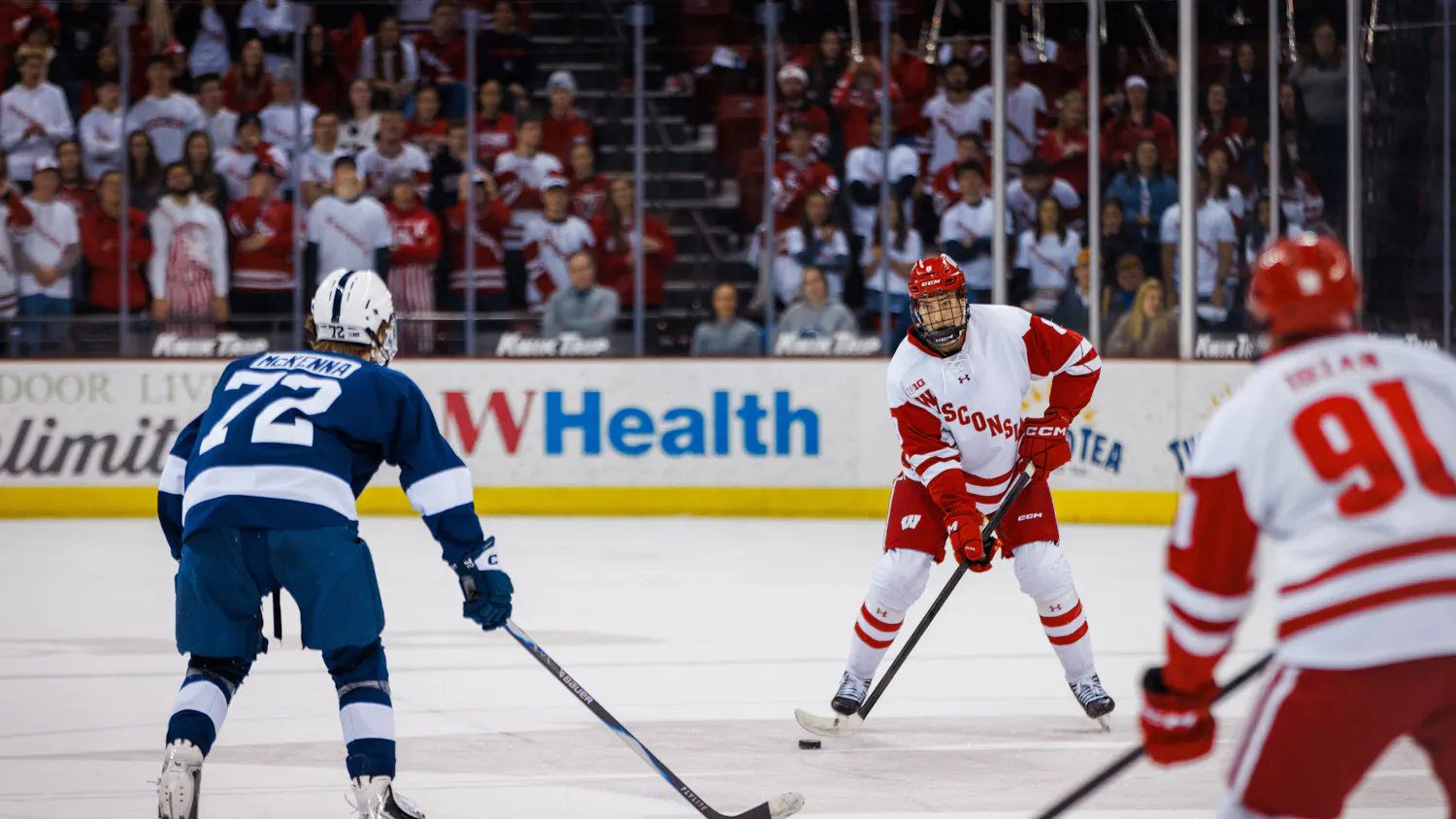
4. Wisconsin: Two years in, the switch from Adidas to Under Armour has been an unmitigated success. The block W is the best logo in the conference, and the helmet design does everything to play up that strength. The jersey numbers are understated but clean, and the white away uniforms have a rare level of feng shui between all the red accents. There’s nothing wrong with these uniforms, but nothing revolutionary either.
3. Michigan State: Finally a team that doesn’t wear red, MSU’s green and white color scheme is classic and complimentary in all the ways that Penn State’s isn’t. The Spartans have started flirting with grey matte helmets and uniforms, and more of that could send them tumbling down these rankings.
2. Indiana: Adidas’ uniform designers have thrown a lot of different styles at the Hoosiers in recent years, and every one has been a success. Indiana has six (!) different helmet designs, all of which manage to be distinctive. The torch-and-star insignia is a much better nod to the state’s flag than Maryland’s garish duds from a few years back, and the script Indiana looks good just about wherever it’s placed. These uniforms are so good that prospective recruits have even cited them as influencing their decision to play for the Hoosiers. It’s safe to say that Crimson and Cream has never looked so good.
1. Michigan: Indiana made a concerted run at the top spot, but the Wolverines still reign supreme in these rankings. The all-yellow kits are a bit bright on television, but that’s more than overcome by the traditional maize and blue outfits. There’s simply not a better combination of colors in college football. The striped helmets look good individually and even better together. Even the white uniforms look great when paired with those helmets. Only a team-wide adoption of Jim Harbaugh’s Walmart khakis could drop Michigan from the top spot.